These days there are a lot of browser-oriented visualization toolkits, such d3.js or jit.js. They’re great and easy to use, but how much do they scale when used with medium-large or very large datasets?
The subject ontology is a quite large (~2500 entities) taxonomical classification developed at Nature Publishing Group in order to classify scientific publications. The taxonomy is publicly available on data.nature.com, and is being encoded using the SKOS RDF vocabulary.
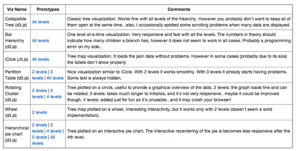
In order to evaluate the scalability of various javascript tree visualizations I extracted a JSON version of the subject taxonomy and tried to render it on a webpage, using out-of-the-box some of the viz approaches made available; here are the results (ps: I added the option of selecting how many levels of the tree can be visualized, just to get an idea of when a viz breaks).

Some conclusions:
The subject taxonomy actually is a poly-hierarchy (=one term can have more than one parent, so really it’s more like a directed graph). None of the libraries could handle that properly, but maybe that’s not really a limitation cause they are meant to support the visualization of trees (maybe I should play around more with force-directed graphs layout and the like..)
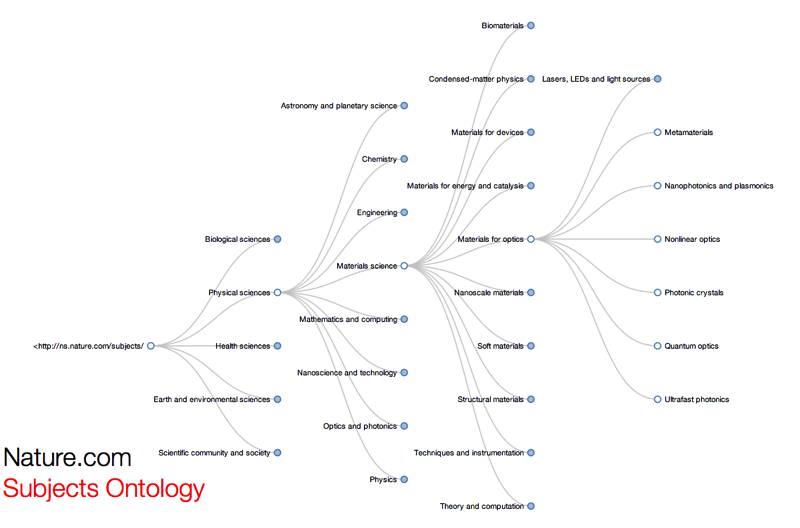
The only viz that could handle all of the terms in the taxonomy is D3’s collapsible tree. Still, you don’t want to keep all the branches open at the same time! Click on the image to see it with your eyes.

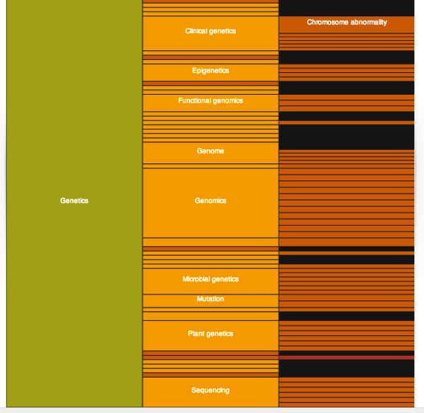
An approach to deal with large quantities of data is obviously to show them a little bit at a time. The Bar Hierarchy seems a pretty good way to do that, it’s informative and responsive. However it’d be nice to integrate with other controls/visual cues that would tell one what level of depth they’re currently looking at, which siblings are available etc.. etc..

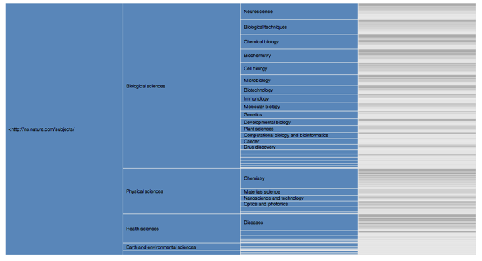
Partition tables also looks pretty good in providing a visual summary of the categories available; however they tend to fail quickly when there are too many nodes, and the text is often not readable at all.. in the example below I had to include only the first 3 levels of the taxonomy for it to be loaded properly!


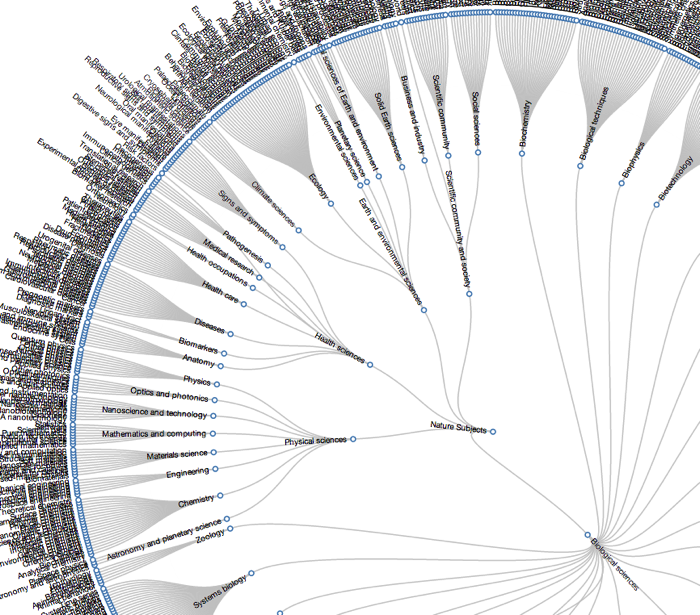
Rotating tree. Essentially a Tree plotted on a circle, very useful to provide a graphical overview of the data but it tends to become non responsive quickly.

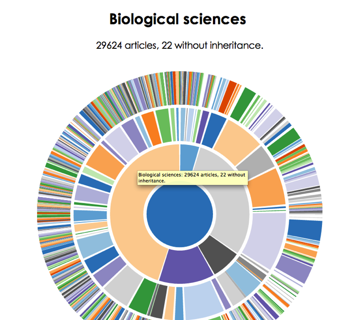
Hierarchical pie chart. A pie chart that allows zooming in so to reveal hierarchical relationships (often also called Zoomable Sunburst). Quite nice and responsive, also with a large amount of data. The absence of labels could be a limiting feature though; you get a nice overview of the datascape but can’t really understand the meaning of each element unless you mouse over it.

Other stuff out there that could do a better job?

