More Jupyter notebooks: pyvis and networkx
Lately I’ve been spending more time creating Jupyter notebooks that demonstrate how to use the Dimensions API for research analytics. In this post I’ll talk a little bit about two cool Python technologies I’ve discovered for working with graph data: pyvis and networkx.
pyvis and networkx
The networkx and pyvis libraries are used for generating and visualizing network data, respectively.
Pyvis is fundamentally a python wrapper around the popular Javascript visJS library. Networkx instead of is a pretty sophisticated package for the creation, manipulation, and study of the structure, dynamics, and functions of complex networks.
>>> from pyvis.network import Network
>>> import networkx as nx
# generate generic network graph instance
>>> nx_graph = nx.Graph()
# add some nodes and edges
>>> nx_graph.nodes[1]['title'] = 'Number 1'
>>> nx_graph.nodes[1]['group'] = 1
>>> nx_graph.nodes[3]['title'] = 'I belong to a different group!'
>>> nx_graph.nodes[3]['group'] = 10
>>> nx_graph.add_node(20, size=20, title='couple', group=2)
>>> nx_graph.add_node(21, size=15, title='couple', group=2)
>>> nx_graph.add_edge(20, 21, weight=5)
>>> nx_graph.add_node(25, size=25, label='lonely', title='lonely node', group=3)
# instantiatet pyvis network
>>> nt = Network("500px", "500px")
# populates pyvis network from networkx instance
>>> nt.from_nx(nx_graph)
>>> nt.show("nx.html")
It took me a little to familiarise with the libraries’ concepts and to generate some basic graphs. So, the tutorials linked below are meant to provide some reusable code building blocks for working with these tools.
Once you get the hang of it though, the fun part begins. What are the best data variables to represent in the graph? What color coding strategy is making it easier to explore the data? How many nodes/edges to display? Can we add some interactivity to the visualizations? Check out the resulting visualizations below for more ideas.
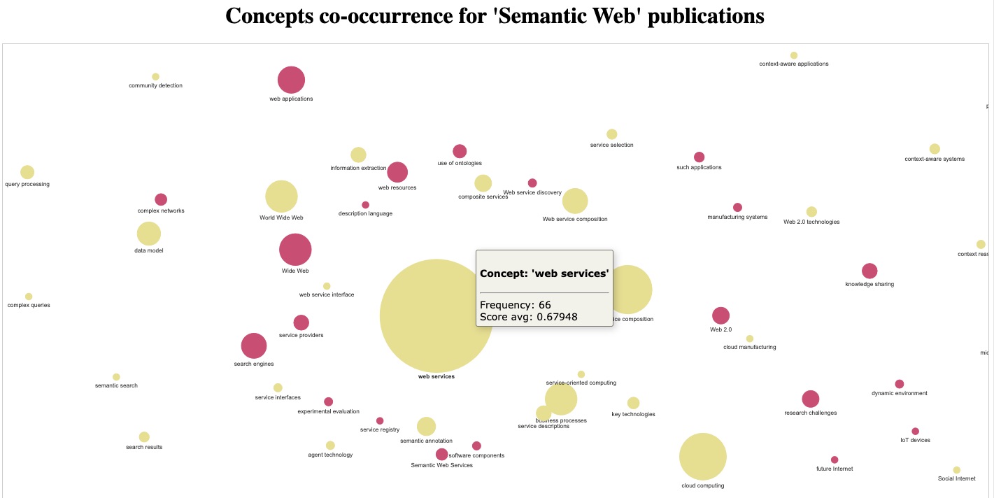
Dataviz: concepts co-occurence network
The Building a concepts co-occurence network notebook shows how to turn document keywords extracted from ‘semantic web’ publications into a simple topic map – by virtue of their co-occurrence within the same documents.
See also the standalone html version of the interactive visualization: concepts_network_2020-08-05.html
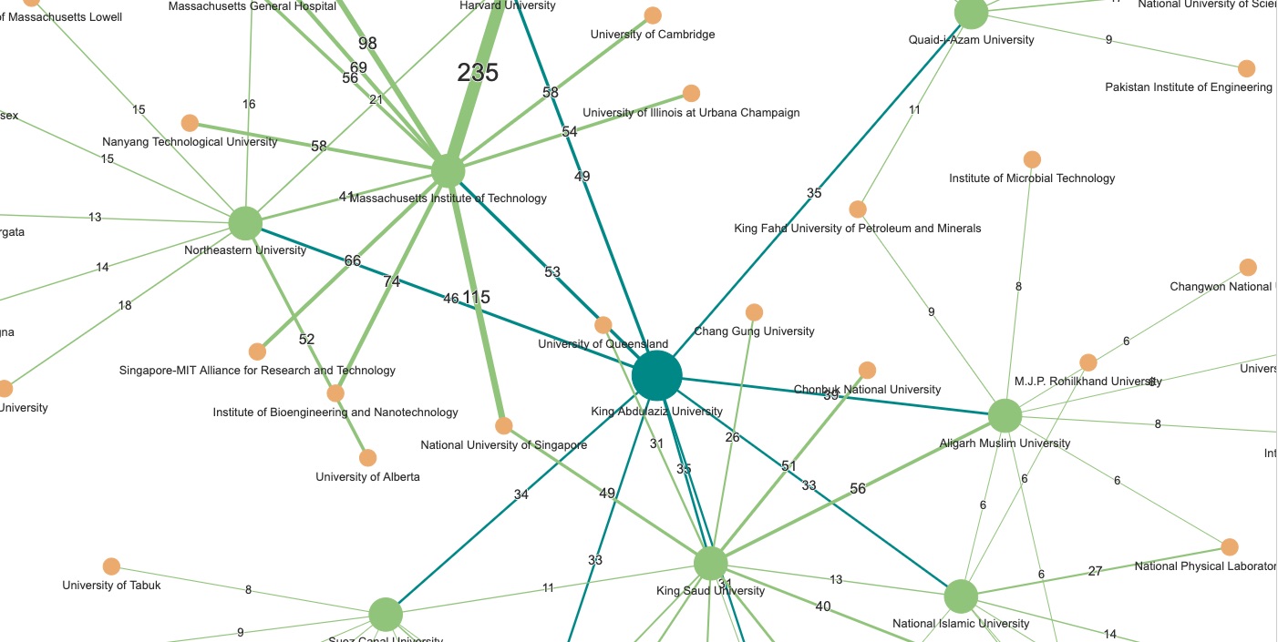
Dataviz: Organizations Collaboration Network
The Building an Organizations Collaboration Network Diagram notebook shows how to use publications’ authors and GRID data to generate a network of collaborating research organizations.
See also the standalone html version of the interactive visualization: network_2_levels_grid.412125.1.html