Aug 2020
More Jupyter notebooks: pyvis and networkx
Lately I've been spending more time creating Jupyter notebooks that demonstrate how to use the Dimensions API for research analytics. In this post I'll talk a little bit about two cool Python libraries I've recently discovered for working with graph data: pyvis and networkx.
Pyvis and Networkx
The networkx and pyvis libraries are used for generating and visualizing network data, respectively.
Pyvis is fundamentally a Python wrapper around the popular JavaScript vis.js library. Networkx, on the other hand, is a pretty sophisticated package for the creation, manipulation, and study of the structure, dynamics, and functions of complex networks.
Example Usage
>>> from pyvis.network import Network
>>> import networkx as nx
# generate generic network graph instance
>>> nx_graph = nx.Graph()
# add some nodes and edges
>>> nx_graph.nodes[1]['title'] = 'Number 1'
>>> nx_graph.nodes[1]['group'] = 1
>>> nx_graph.nodes[3]['title'] = 'I belong to a different group!'
>>> nx_graph.nodes[3]['group'] = 10
>>> nx_graph.add_node(20, size=20, title='couple', group=2)
>>> nx_graph.add_node(21, size=15, title='couple', group=2)
>>> nx_graph.add_edge(20, 21, weight=5)
>>> nx_graph.add_node(25, size=25, label='lonely', title='lonely node', group=3)
# instantiate pyvis network
>>> nt = Network("500px", "500px")
# populate pyvis network from networkx instance
>>> nt.from_nx(nx_graph)
>>> nt.show("nx.html")
It took me a little while to familiarize myself with the libraries' concepts and to generate some basic graphs. Once I got the hang of it though, the fun part began. What are the best data variables to represent in the graph? What color coding strategy makes it easier to explore the data? How many nodes/edges should be displayed? Can we add some interactivity to the visualizations? Check out the resulting visualizations below for more ideas.
Building a Concepts Co-occurrence Network
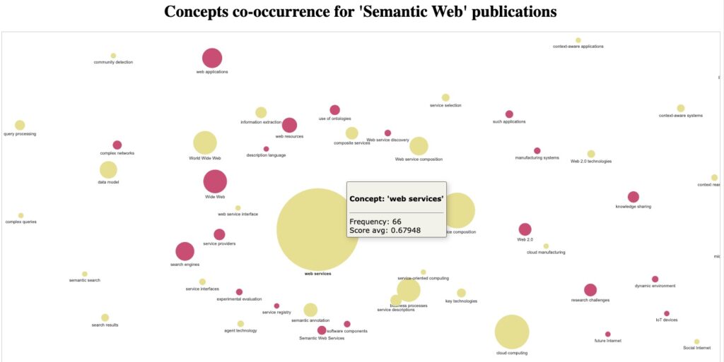
The Building a concepts co-occurrence network notebook shows how to turn document keywords extracted from 'semantic web' publications into a simple topic map by virtue of their co-occurrence within the same documents.
An interactive HTML version of the 'Semantic Web' concepts network can be found here: concepts_network_2020-08-05.html
Building an Organizations Collaboration Network Diagram
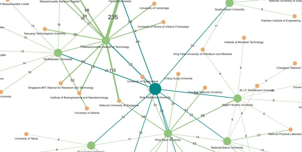
The Building an Organizations Collaboration Network Diagram notebook shows how to use publications' authors and GRID data to generate a network of collaborating research organizations.
An interactive HTML version of the Organizations Collaboration Network can be found here: network_2_levels_grid.412125.1.html
Key Takeaways
Working with pyvis and networkx has been a great learning experience. Some key insights:
- Start simple: Begin with a small dataset to understand the data structures before scaling up
- Interactivity matters: The interactive features of pyvis make exploring complex networks much more intuitive
- Color and size coding: Use visual properties strategically to convey different dimensions of your data
- Performance considerations: Large graphs (thousands of nodes) can become slow; consider filtering or sampling your data
These tools are excellent for research analytics, social network analysis, citation networks, and any domain where relationships between entities matter. Give them a try!
Cite this blog post:
Comments via Github:
See also:
2012
NeDiMaH workshop on ontology based annotation, held in conjunction with Digital Humanities 2012, Hamburg, Germany, Jul 2012.

