Infographics Course, Week 1
This is a short summary of the activities in week 1 of the Introduction to Infographics and Data Visualization massive online course offered by the Knight Center for Journalism at the University of Texas. I'll be posting the course materials and exercises here on the blog, so stay tuned if you want more.
The course is hosted by Alberto Cairo, author of the book 'The Functional Art'. It's been only a week since we started, but I can definitely tell that the quality of both the teaching materials and overall e-learning platform is very high. So I'd highly recommend it to anyone interested in deepening their knowledge on such topics. It's too late to sign up for it now, but there will be another class running in early 2013, so keep an eye on their site if you don't want to miss the next enrollment.
Key Concepts from Lesson 1
- Infographics is a piece of functional art (different from pure art) - the stuff in the world is shapeless and useless, it requires people to give it a form (to model it) according to some specific purpose - our world is not about ideology anymore, it's about complexity (Matt Taibbi en Griftopia) - the model of information designers is to model that raw material and make sense of it - infographics is not just about summarizing, organizing data, but it's also about letting reader explore those data - a graphic is a tool: it extends our skills and capacities - any good infographics is functional as a hammer - the design predetermines the function the tool should have. - any good infographics is multilayered as an onion - eg as in a summary of main points, plus more in depth examinations - any good infographics is beautiful and true as a mathematical equation
-
function doesn't dictate form, but it restricts the variety of forms that are acceptable to use for each set of data
-
classic distinction:
- infographics: presents information in a way that becomes meaningful; it's an edited story based on data
- information visualization: fine-tuned so to support exploration; doesn't tell a particular story, but it allows users to create their own story (it's unedited).
-
for Cairo, the difference is very fuzzy, often the two things are mixed together
-
Definition: a good infographics lets you answer questions more efficiently
-
considering infographics only as art is wrong: infographics are tools. Often graphics with no structure or no context are presented as inforaphics, but they are not a visual representaion of the data, just a simple page layout exercise with a bunch of unrelated numbers
-
numbers have little meaning if they can't be compared with other data (eg summaries) or if I can't relate them to my life (eg contextual information)
-
infographics should be constructed in many layers so that data could be cross-compared in many ways
-
choosing the correct 'visual metaphor' is essential for an infographics
-
if your goal is to let users compare numbers, it's better not to use bubble charts but bar charts! The human brain is not good at comparing sizes of bubbles. Bubbles are good for presenting overall patterns, but not good for precise comparisons.
-
the 'onion' approach allows you to represent data in different ways to facilitate different kinds of tasks
-
Infographics and visualization must be considered as visual tools for communication, understanding and analysis
-
Charles Joseph Minard 1869: cosidered by many (eg Tufte) the best visualization ever!
The exercise
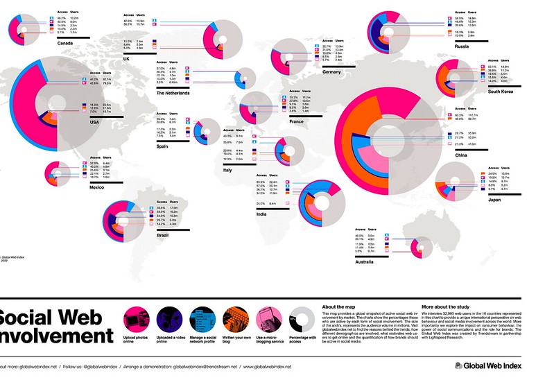
See the following graphic (socialwebinvolvement.jpg) and try to answer the questions
1) Is this infographic really “functional” in the sense of facilitating basic, predictable tasks (comparing, relating variables, etc.)? Not really. If we think of an infographics as a 'technology' this is certainly a very poor one. Apart from the fact that China and USA have the biggest audiences (in absolute terms) it's extremely difficult (if not impossible) to use the graphics as a tool in any other way. Several variables are presented, but we can't compare, organize or correlate the data cause they're all expressed in a way that doesn't support those actions. Moreover the choice of using bubble charts is not approriate, as they make it harder for people to make comparisons among surface sizes. 2) If not, how could it be improved? Similarly to what discussed in chapter two of the handouts (see the armed forces employees example), I'd do the following things: a) eliminate the bubble charts, and replace them with bar charts b) create bar charts for both absolute and relative values using a derived variable c) improve the rendering of the labels, since now they're a bit too small and hard to read. This could be done for example by using a specialized type of bar chart where the 'bar' is divided into 5 continuous coloured segments corresponding to the types of social web involvement. d) keep the geographical map in order to provide some context; however, it could be shrunk, positioned at the bottom and used primarily to highlight which are the countries being examined in the experiment (eg by having their areas in a different color)
3) What kind of headlines, intro copy, and labels could it include to make it meaningful for a broad audience? I think that the correlation between the label colors and their meaning should be made more explicit.
4) What other variables (if any) should be gathered/analyzed if we want to give an accurate portrait of Internet users across countries? Could we go beyond what is currently presented? Can we provide a better context for the data? It'd be nice to have a sense of the total number of users per country, versus people that admittedly don't use the internet (or social media). Also, it's not clear whether the 32000 users interviewed have been split proportionally to the total population of the countries taken into consideration, or not. Other variables that it'd be nice to investigate are - mean of access of the internet: eg mobile phone, computer, tablet - age distribution - overall context of internet usage: eg leisure, work, education
Other Approaches
Here're the work of other students (not me) who tried (with impressive results) to redesign the graphic above:
http://www.flickr.com/photos/89317425@N05/8150814858/ http://dl.dropbox.com/u/43885573/Draft2.jpg http://www.flickr.com/photos/aaugur/8144159956/sizes/k/in/photostream/ http://www.flickr.com/photos/rubenvalero/8139950164/ http://n79.org/infographics/asg1/ http://public.tableausoftware.com/views/SocialWebInvolvement_1/Dashboard1?:embed=y
Cite this blog post:
Comments via Github: