Infographics Course, Week 2
Here are the materials related to the second week of the Introduction to Infographics and Data Visualization online course. This week we talked about two topics: a) Visual Perception and Graphic Design Principles and b) Planning for Infographics and Visualizations. The exercise focused on an interactive visualization available on the New York Times website.
Key Concepts from Lesson 2
A) Visual Perception and Graphic Design Principles
- The principles of design are grounded on how perception works
- Visual perception works differently from what we think
- we don't have photographs in our heads!
- the eye passes on signals to the brain, which elaborates and makes assumptions about the perception
- eg think of the classic geometrical visual illusions
- Visual perception is an active process. The brain is not a passive receptor of information, but it completes, organizes and creates priorities (or hierarchies) and relationships to extract meaning
-
If we know that, the goal of the designer should be to arrange compositions anticipating what the user's brain will most likely do
-
The key to any visual design is the presentation of a cohesive, structured, readable and understandable composition.
==> check online examples by John Grimwade
First goal when arranging elements on a page: - think about a composition - Structure / Order / Hierarchy / Harmony / Balance
Main principles of Graphic Design Unity: presentation of a composition as an integrated whole Variety: is the opposite of unity, but also its complement. With too much variety, a composition will look randoml with too much unity, it will look boring Hierarchy: the balance between unity and variety can lead to a good hierarchy - answers the question: where should I start reading the infographics
Strategies for achieving Unity, Variety and Hierarchy Grids, Color, and Type
Grids - they can support unity thanks to a sense of alignment - help keep the consistency - key to using grids: think of the composition as a set of rectangles - first step in building an infographics: divide up the space into functional rectabgles - headline / intro / map / chart / timeline etc... - tip: things that are stacked on top of each other should have the same width - tip: if objects are side by side, they should have they same height
Fonts, Colors - different fonts can be use to achieve variety, and support the creation of a hierarchy - same with colors: eg using a Copy Color (eg Black) an highlight color (eg yellow) and a series of Neutral Tones (grey shades)
B) Planning for Infographics and Visualizations
Creating a chart consists of making a data set adopt a visual shape
==> seminal paper by William Cleveland and Robert McGill on infovis - scale of charts that allow more accurate/generic judgements eg barcharts are accurate and facilitate comparison eg color gradation graphs or bubbles are generic (=show big trends)
-
correlation coefficient
- formula that represent the correlation between two series (on a values between -1 and 1)
- scatter plot: good at representing correlation between two variables
- slope graph: another way to represent correlation (although it's usually employed to represent change over time)
-
Types of charts
- line charts: display variation of one or more magnitudes over a time period by means of rising and falling lines
- Comparison Charts: visualization of amounts, each represented by a bar (or toher objects)
- Distribution Chart: division of a whole into its components. It can be represented by a circle ('pie') or by other objects, such as a divided bar
- Correlation chart: shows the correlation between two (or more) variables. Also called scatter plots
-
Common components of a graphic
- headline: clearly stated what the graphic is about, or makes a point
- values
- axes
- sources/attribution info
- byline: who made the graphic
- legend
Styling a graphic with colors and fonts makes the graphic more readable (= create the hierarchy)
Things to avoid - Dont' distort charts (eg 3d effects) especially with pie charts, as it makes it more difficult to compare areas - Avoid vertical labels - Avoid backgrounds that detract attention from the main graphics (eg photographs etc) - Avoid creating overloaded compositions
The Design Process - Learn as much as you can about the topic - Identify goals and challenges - Prototype and sketch - Test and tweak - Turn the project in
The exercise
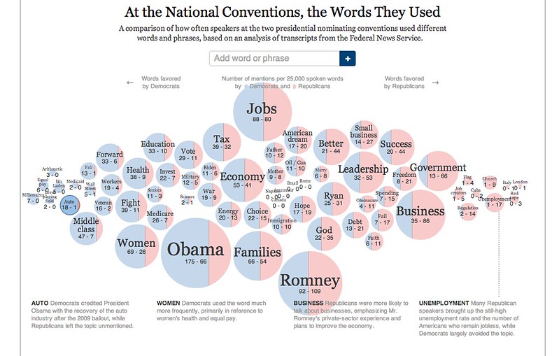
See the following graphic, by The New York Times, an interesting project that allows you to compare the words that were used in the National conventions. Imagine that you are hired by Steve Duenes, infographics director at the Times, to make a constructive critique of that piece. What would you say about it?
Here's my comments about the NY visualization:
- The infographics allows to compare the two different parties usage of a certain word rather intuitively, so in that sense it is functional. The visualisation based on bubbles’ areas is usually clear; in cases where the two areas are very similar you can still get the ratio right thanks to the percentage numbers displayed.
- The fact that you can move around the bubbles is eye-catching and fun to use, but it fails to provide any added value to the tool (= no extra functionality other than maybe organising the words some other way). This is detrimental to the understanding of the structure and purpose of the visualisation: the bubbles’ location seem to imply a semantic correlation of some sort, but unfortunately it doesn’t have any.
- I’d expect to be able to filter the quotes by speaker, so to compare the usage of a certain word only between two specified people (e.g. Obama and Romney). Unfortunately that is not possible. Also, it’d be nice to be able to order or re-organise the citations on a timeline, so to explore potential patterns in the increase/decrease of use of a word. All of this could be easily achievable by introducing a ‘filter by’ panel right on top of the the quotations columns. The types of filters could be others too, eg geographical ones (by state or regions), or by the importance of the ‘roles’ of the speakers (majors, governors).
- The main issue from the interactivity point of view is that when you click on a bubble (assuming a user understands that’s what he/she has to do - btw no tooltips at all!) it’s not immediately obvious that the bottom part of the screen gets updated. I’d add some mechanism, such as a partial screen refresh, or a ‘loading’ icon, that would make this process more transparent.
- There is no way to remove a bubble once you’ve added it. So if you’re trying to compose your own ‘view’ of the tool by selecting only words you are interested in, once you get something wrong you’ve stuck with it (you can only restart from scratch by reloading the page)
- The 4 static captions at the bottom (AUTO, WOMEN etc..) are ok at the beginning of the visualisation, but once you start moving things around they don’t update at all which is not really the expected behaviour.
- If the full transcripts the quotations derive from are available online, it’d be nice to be able to link directly to them e.g. by clicking on the quotations themselves. This would allow to investigate further the original context of use of a word.
- Having small photos on the side of a speaker’s name would make it easier to identify these people; also, it shouldn’t be too difficult to include links to the person’s home pages or wikipedia entries.
Cite this blog post:
Comments via Github: